Rumor has it that 2012 was the first year since 2001 that PC sells were less than they were the year before. So what are consumers buying instead of PC’s? Well tablets for one thing.
I just picked on up for myself, I know a – a little behind the curve. The truth is I don’t like to jump on the fad as soon as it comes out, I like to wait little bit and see what companies make and what ends up offering the most bang for is buck. I am not member of the Apple Cult, that is not to say that I do not own any Apple products, it just means that I am by no means a devoted follower. I will try any company that has a good product at a reasonable price.
Last year tablet sales exceeded 100 million for the first time. Not only that but some are saying that their sales are expected to surpass notebook sales in 2013. This doesn’t surprise me either, after picking up the new Nexus 7 tablet for myself, I headed up to the local shop and picked one up from my wife the same afternoon. This year instead of updating her notebook, she will do most of her web browsing on her tablet.
Along with viewing websites on tablets, many people are surfing the web from their smartphones. Most of the U.S. mobile subscribers are now using smartphones instead of feature phones and this is happening at an extraordinary pace.

Check your Analytics and see how many people are viewing your site with a smart phone, many popular sites are reporting having over 30% traffic via a mobile device.
For those who build websites for a living this leads to one conclusion: we have to build websites for a never ending plethora of screens that users will be viewing while they search our sites on a different devices.
Building apps was the first solution, but this is starting to change with the use of the tablet. What we are finding out through Analytics and research is that most people would much rather view a usable website over an app.
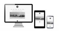
When it comes to building a new website there is plenty of data stating that respnsive websites are key to maximize the user experience. The solution then is to make a website that will work on every device. This is what designers have coined Responsive web design (or RWD).
Responsive web design is an approach to web design where the site is designed to provide the best possible viewing experience—easy reading and navigation with a minimum of resizing, panning, and scrolling—across a wide range of devices (from desktop computer monitors to mobile phones)